The Atlantic published a graph showing the volume of tweets related to the Democratic convention (w/ speech by Michelle Obama on second night) and how that volume compares with tweets related to the Republican convention (see below).

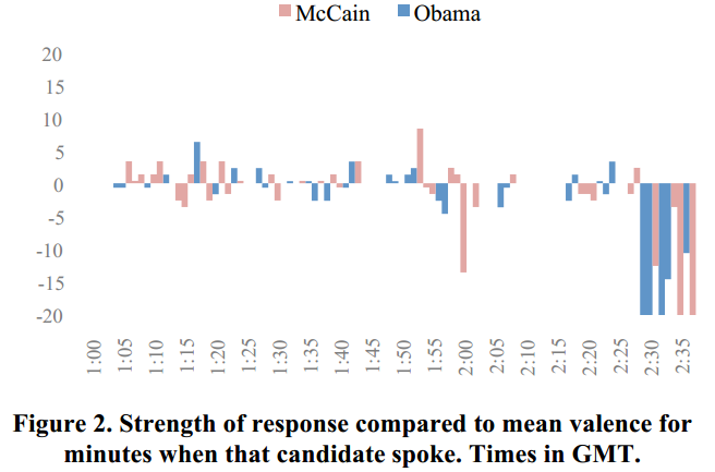
While this is really interesting and data that is easy to capture (see Twitter’s blog post), the aggregate number of tweets can be very deceptive. For example, if you only collect tweets that had the word “Obama” in it, there is no way of figuring out whether or not the tweet was actually supporting Obama. Although it is somewhat unlikely that Republicans would be actively using the #dnc2012 hashtag, you don’t know unless you look at the actual tweet content. Even if you said something negative, it would still “count” in an aggregation just based on a hashtag search. A great example of Twitter analysis that takes valence into consideration is a paper by Nick Diakapoulos and David Shamma (download), which looked at the presidential debate between McCain and Obama in 2008 and looked at the sentiment of the message- positive or negative (see graph below). I think this sentiment analysis gives people a better idea of what people are actually thinking.
Number of tweets is also a concept that is difficult to interpret. What does “more tweets” mean? It could be indicative of audience attention, or it could be because a controversial topic lit the flame for more discussion. However, regardless of the topic, you cannot be certain whether or not the tweets mirror the sentiment of everyone- including non-social media users, so that is something that we should keep in mind so that Twitter results are not misinterpreted.The best practical use of this data would be to map the tweets to the content of the speech based on the time (which is doable if you have a live event) and see how the content corresponds with the types of tweets and the volume of tweets.
That’s exactly what I did for my study, Tweeting about TV, which analyzed two types of “live” events that were televised. One of the events was Obama’s Nobel Prize Acceptance Speech. As you can see in the graph below, the volume of tweets showed a roughly similar pattern, but in terms of what type of tweet was salient and when, it was very different.
I think the methods used by Nick and myself are useful- especially for people who write speeches and those who analyze the impact of speeches- not because live tweets represent what everyone thinks, but because the analyses can give you an idea of how people are responding to the content.
